Navigating the UI
A complete guide to navigating the BIION-D Cloud Panel — sidebar, header and page structure.
This page explains how the BIION-D Cloud Panel is structured and how to move between different sections.
Interface Layout
The Cloud Panel consists of two main areas:
Sidebar (left)
The vertical sidebar provides navigation to all Cloud Panel sections. It can be collapsed manually and switches to icons automatically on portrait screens.
Top bar (top)
The top bar shows the current page name, contextual action buttons and search/filter controls.
The main content area fills the rest of the screen to the right of the sidebar.
Sidebar
The sidebar is always visible and contains buttons for each section of the Cloud Panel:
| Icon | Page | Description |
|---|---|---|
 |
Dashboard | Summary of models, training jobs, devices, and users |
 |
Workspace | Workspaces and their action plans |
 |
Models | AI models, image datasets, and training history |
 |
Devices | Connected on-premise nodes and their status |
 |
Users | User accounts, roles, and organizational hierarchy |
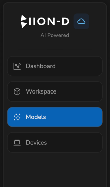
The current page is highlighted and its button is disabled (not clickable). Click any other button to navigate to that section.
On desktop, use Collapse at the bottom of the sidebar to show icons only. Select the control again to expand it. The browser remembers your choice.
On portrait screens, the sidebar collapses to show only icons without text labels.
Top of the Page
Each section page has its own toolbar at the top of the content area:
| Element | Position | Description |
|---|---|---|
| Page title | Left | The name of the current section (e.g., “Workspace”, “Models”) |
| Action buttons | Center/Right | Context-specific buttons (e.g., Register Device, Create Workspace) |
| User view | Center/Right | For authorized roles, selects the account whose data is displayed |
| Search / filters | Right | Available on list and table views to narrow results |
| Account | Right | Shows username, role, ID, and the Logout command |
Select the user icon to open the account menu. Select outside the menu or press Esc to close it.
Modals
Some actions (registering a device, creating a user, changing ownership) open a modal dialog over the current page. Close a modal with the Cancel button or the ✕ icon in the modal header — no changes are saved unless you confirm.
Login Page
Before accessing the Cloud Panel, you must authenticate on the Login page. Validation errors appear next to the affected field. After successful login, you are redirected to the requested page or to the Dashboard.
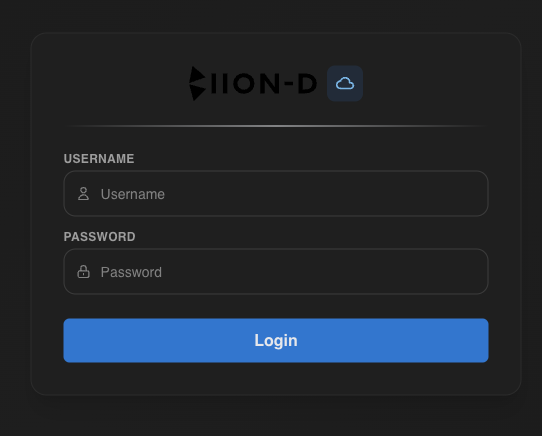
If you are already authenticated, navigating to the login page will redirect you to the Cloud Panel automatically.
Page Flow
The typical workflow through the Cloud Panel follows this order:
Check the Dashboard
Start on the Dashboard for an overview of models, training jobs, license, and usage.
Browse Workspaces
Go to the Workspace section to view workspace configurations and action plans synced from your nodes.
Manage Models
Navigate to the Models section to browse AI models, view training history and explore image datasets.
Monitor Devices
Visit the Devices section to check the status of connected on-premise nodes.
Navigating Back
Within sections that have a list → detail flow (Workspace, Models, Users), use the ← back arrow button in the page toolbar to return to the list view.
Responsive Behavior
- On desktop, you can expand or collapse the sidebar manually
- On portrait screens, the sidebar shows icons only
- The title, actions, and User view selector wrap when space is limited
- Model card actions remain available on devices without hover